Bold, textural colours and the beauty of decay
We like broadening our horizons at ‘The Mount Studio’ and Claire had stumbled upon an online course through ‘Living etc’ magazine and the KLC design school about ‘The Power of Colour’.
Architects can be notorious for painting interiors white and wearing black clothes, we try to not always fall into this stereotype and the course brought up some interesting issues.
As Architects we try to rely on the materials of a scheme to add colour, texture and atmosphere. Internally spaces can be plastered which can allow for colour application and playfulness in some way or other.
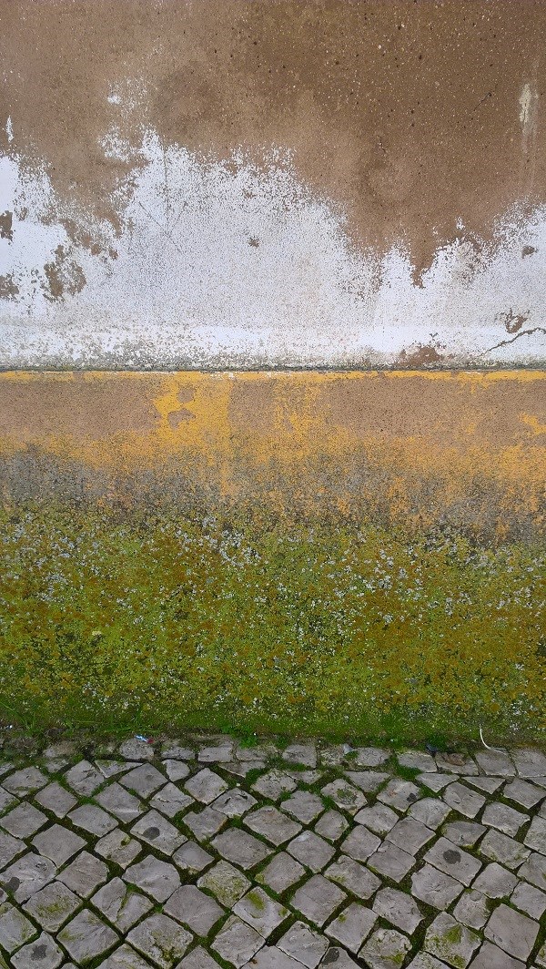
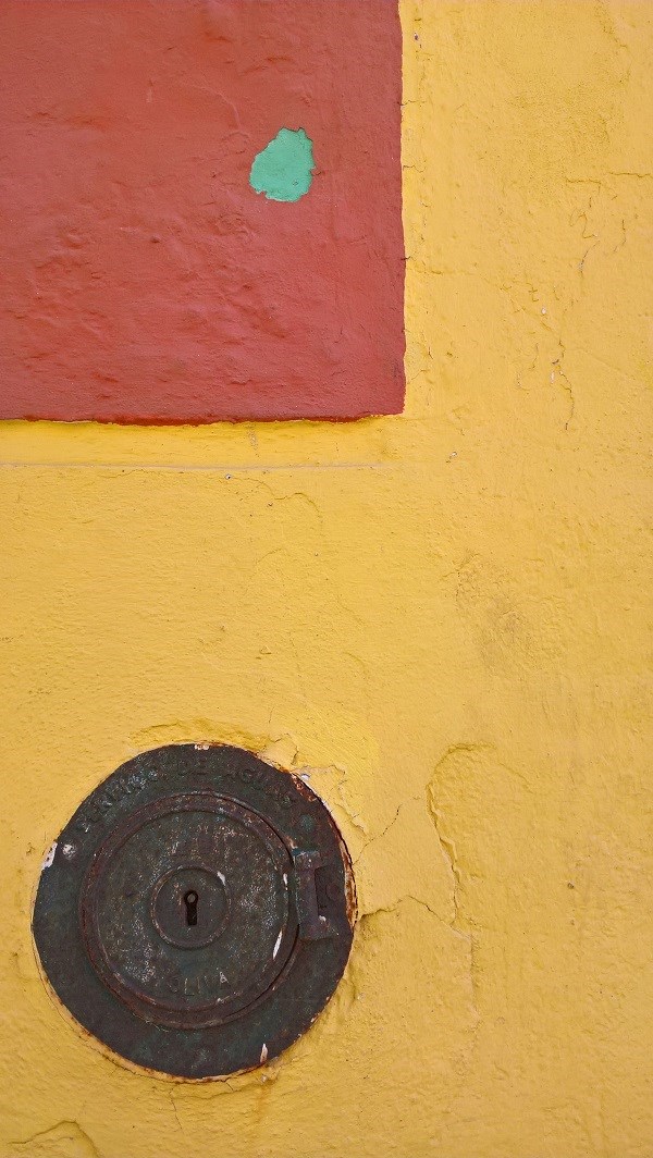
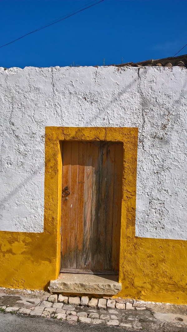
The course talked about the technical and theoretical issues behind colour application in general and interior design. Part of the project work was to take and collate a series of ‘colour’ images, we were away at the time on a visit to Portugal so we made the most of investigating and re-discovering what colour meant to us!
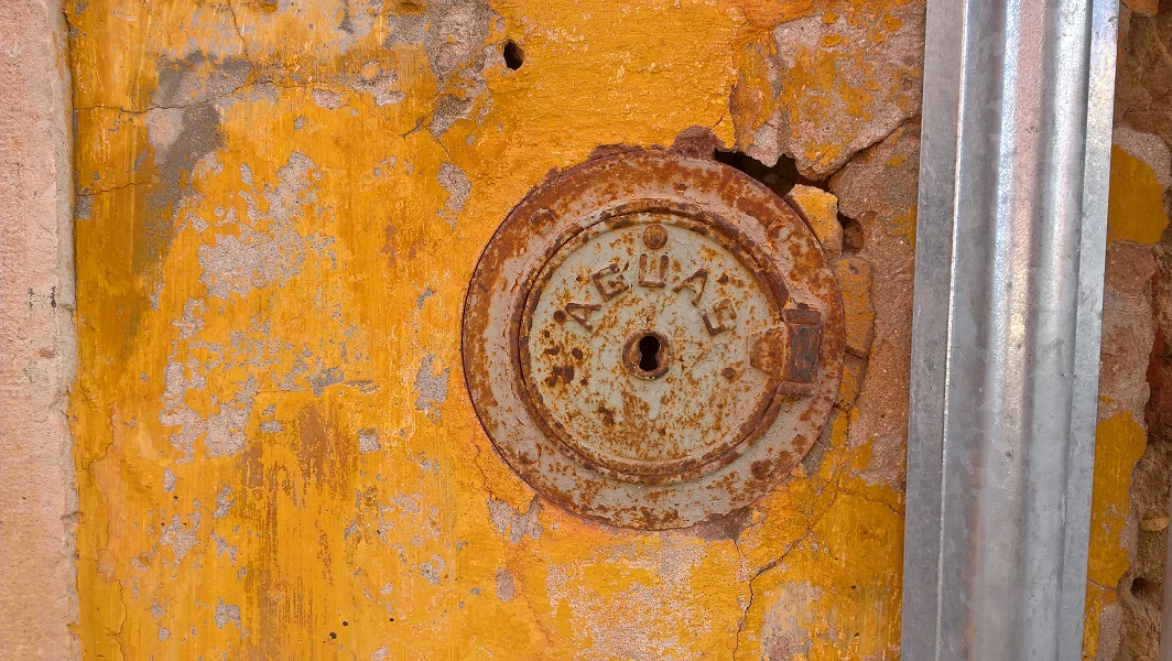
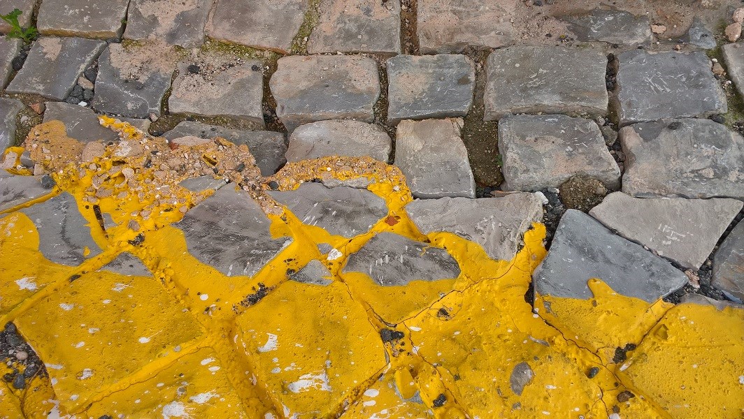
We really enjoyed this exploration and realised that we were enjoying the layers of history that were exposing themselves, the general ‘patina’ and even decay! The colours were wonderful and the textures also became quite beautiful as they revealed their history to us.
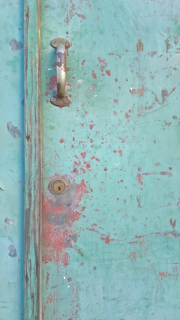
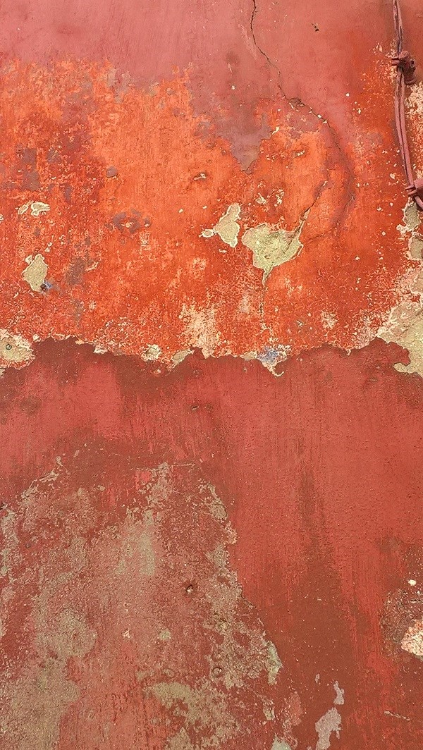
There is something quite beautiful about a natural material weathering and enriching a space or place. Although of course we do not want any of our projects to ‘decay’ we do enjoy the idea that especially a natural material can provide a ‘patina’ over time that makes a building richer the longer that it sits in its ‘place’.
We hope you enjoyed this small selection from our ‘colour’ palette.
Comments